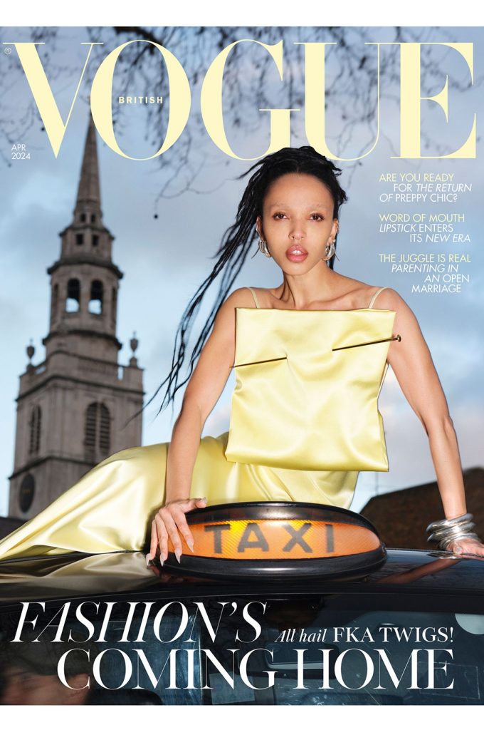

I recently posted on Threads the most recent cover of British Vogue stating my disappointment in its failure as a cover. Some questioned my position on making such a comment ( I have previously art directed Elle and Tatler as well as designed many magazine and book covers over the last forty years) but the majority of comments focused only on the chosen photograph.
This was missing the point as although subjectively I saw very little merit in the image I was commenting on the cover as a whole. In that sense my comments were objective and based upon the contextual requirements of a magazine cover in the UK. The photograph was an element of the overall design and therefore needed to perform a role within the cover design. The UK is a newsstand dominated environment where a cover is everything to the magazine’s success. It needs to grab a person’s attention, draw them towards it and encourage them to pick it up. It needs to appeal to the regular reader, the occasional reader and the ‘never’ reader if it is going to be successful in selling the issue.
The cover lines, what they say and the way in which they are presented are also key factors in the cover’s success. They must provide inspiration, aspiration and information. They must promise entertainment and education. To do this they must be clear, concise and legible. They must work with the image and create an aesthetic whole. There are many ways to do this. There are rules to be considered and rules to be broken but designing a successful magazine cover is not easy. It requires confidence, experience, creativity and understanding. The designer’s/art director’s art is in bringing photography and typography together to make each stronger thanks to their new relationship. This is why they should be respected and paid appropriately.
The cover I identified and which I have included here fails in all of these requirements. That’s not because I don’t like it or because I am too old to understand new practices, it is because it fails to meet its requirements to appeal to the reader. How do I know? Because sales figures at newsstands are plummeting. Further proof of this is clear in the price of the issue in question which is the first issue ever of British Vogue to be produced without an editor with printed magazine experience. The new editor, Chioma Nandi, has the title Head of Editorial Content and comes from a primarily website based background. The price was a reduced £2.00 in my local supermarket, and not the usual £3.99. A smple and obvious tactic to improve newstand sales.
It brings me no pleasure to raise the issue of a magazine cover that fails so dismally to perform its basic function. I love magazines and spent ten years of my life art directing and designing covers in the very building that British Vogue was once made in. Vogue was always more than just a fashion magazine. It was a home to great writing and photography. Under different editors and art directors it challenged what constituted magazine design and content but now it has left the building that was it’s home for six decades it seems that it has left behind its understanding of what makes a successful cover. Sadly, the inside of the magazine was confused, poorly designed and unfocused. Perhaps, in this sense the cover was an accurate relefection of its contents.
Photography that has a function requires those that work with it to understand that function. It is the photographer’s name that goes alongside the image and if it is poorly chosen, used or presented those decisions directly reflect on the photographer and their work. The designer and art director’s names will appear on the masthead but not next to the work they are responsible for.
In the past such knowledge was passed from generation to generation amongst journalists and designers. I learnt from those who gained their experience in the 1960s and 70s, I passed on that knowledge to those who worked for me in the 1980s, 90s and 2000s. Unfortunately, that sense of creative baton passing ended as our current century progressed and now we are left with is what we see here.
There is still strong work being produced by editorial designers within the independent magazine sector and internationally where newsstand sales are not as commercially critical, but it is becoming increasingly clear that the mass market publishers in the UK no longer care, know or understand how or why the design of a magazine cover is an art form that is dying alongside their magazines as is the needed showcase for photographers work they once provided.
Dr.Grant Scott
After fifteen years art directing photography books and magazines such as Elle and Tatler, Scott began to work as a photographer for a number of advertising and editorial clients in 2000. Alongside his photographic career Scott has art directed numerous advertising campaigns, worked as a creative director at Sotheby’s, art directed foto8magazine, founded his own photographic gallery, edited Professional Photographer magazine and launched his own title for photographers and filmmakers Hungry Eye. He founded the United Nations of Photography in 2012, and is now a Senior Lecturer and Subject Co-ordinator: Photography at Oxford Brookes University, Oxford, and a BBC Radio contributor. Scott is the author of Professional Photography: The New Global Landscape Explained (Routledge 2014), The Essential Student Guide to Professional Photography (Routledge 2015), New Ways of Seeing: The Democratic Language of Photography (Routledge 2019), and What Does Photography Mean To You? (Bluecoat Press 2020). His photography has been published in At Home With The Makers of Style (Thames & Hudson 2006) and Crash Happy: A Night at The Bangers (Cafe Royal Books 2012). His film Do Not Bend: The Photographic Life of Bill Jay was premiered in 2018.
Scott’s next book Inside Vogue House: One building, seven magazines, sixty years of stories, Orphans Publishing, is now on pre-sale.
© Grant Scott 2024
Like this:
Loading…


